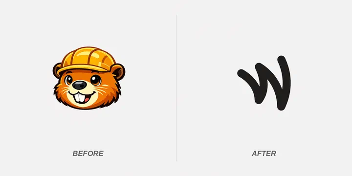
Weavestream has a new look. The old beaver logo is gone, replaced by a simple, geometric W, and the whole website has been redesigned around it.
This is the kind of change that deserves a short explanation, especially because I’ll admit up front that we miss the beaver.
Why a Beaver Made Sense
A beaver was never a random choice. Beavers are builders. They take a stream, work steadily with whatever materials are at hand, and shape the water into something organized and useful. They are also famously busy, and they build things that last.
That fit what we’re making. Weavestream takes the scattered flow of information in an IT environment, such as clients, assets, credentials, and procedures, and weaves it into a structure your team can rely on. A hard-working builder at the edge of a stream was a friendly way to say that.
It gave the project some personality, too. Open source tools can be dry, and a busy beaver made ours feel like something made by a person.
Why We Let It Go
Weavestream is used in professional environments: MSP offices, client reviews, security questionnaires, and internal IT teams who pull the documentation up in front of customers. In those settings, a cartoon mascot sends a message we didn’t intend. It can make a serious tool look like a hobby project.
A clean mark is easier to live with. It stays legible at favicon size, works in one color, adapts to dark mode, and doesn’t compete with the content. So we made the call: the beaver retires, and a cleaner W takes its place.
A Proper Goodbye
It wasn’t an entirely painless decision. The beaver, hard hat and all, was there from the start. He carried the blueprints, hauled the logs, and gave a young open source project a friendly face when it had nothing else going for it. A lot of the early story of Weavestream is wrapped up in that grin.
So, to the busy beaver: thank you. You built the first version of the brand, and you did it with a smile and a toolbelt. The dam is built, the stream is flowing, and your work here is done. Enjoy a well-earned rest.
The New W
The new mark is a single continuous stroke that folds into a W. It echoes the idea of weaving that gave the project its name, without needing an illustration to explain it. You’ll find it in the site header, as the browser tab icon, and on home-screen icons. The favicon even switches colors between light and dark mode.
A Complete Visual Overhaul of the Website
The logo change was the spark, but we didn’t stop there. Every page on the site has been redesigned to match.
The new look is calmer and more structured. Thin ruled lines give each page the feel of a well-organized document, which suits a product built around documentation. The homepage opens with a bigger, bolder introduction and a guided tour that walks you through what Weavestream does as you scroll. A neutral palette with a single cyan accent keeps the focus on the content, and the same style carries through the product, integrations, open source, and alternatives pages, and this blog.
What Hasn’t Changed
Weavestream is still free, open source, and yours to host. The redesign changes how we present the project, not what it is. The copy, the features, and the principles behind them are the same: you own your data, and your documentation shouldn’t be rented back to you.
Take a look around weavestream.io, and let us know what you think. If you spot something that looks off, we’d like to hear about that too.